

The Devil’s Canyon Winery
The Devil’s Canyon is a fictional winery based in Sonoma California

The Objective
The Devil's Canyon Winery has invested in creating an inviting space at their vineyard, which showcases not only the stunning surrounding landscape but also the distinctive architecture of their property. The goal for this brand identity is to encapsulate these elements and evoke a sense of connection and nostalgia in visitors. By intertwining various visual cues into their branding that envoke memories of a unique experience, at Devil's Canyon Winery.
The aim is that customers will relish their wines as more than just a beverage, but as a cherished reminder of their visit to the winery.


EXPLORATION
Exploration of typefaces and brand name lockups. The goal was to craft something both refined yet approachable.
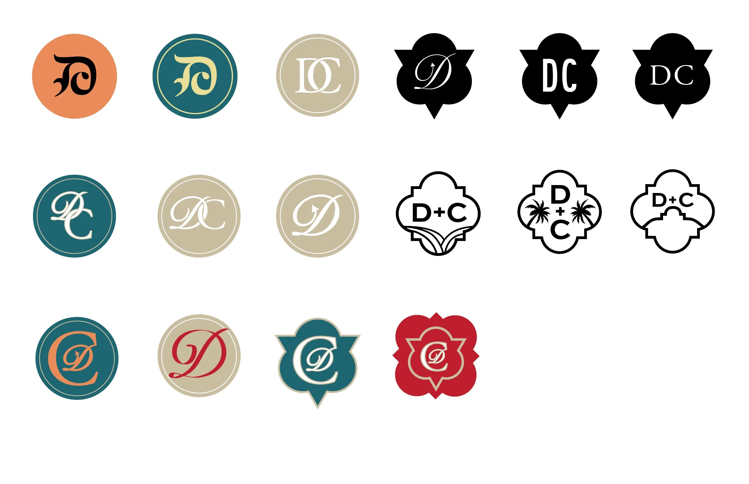
EXPLORATION 2
A monogram logo to represent the brand was also explored. Though this direction was eventually abandoned the study did yield some some solid options.

PROCESS
In an effort to highlight the architectural beauty of the winery as well as the artistry and science of the wine making process images of the property were altered to have a hand drawn organic feel.

EARLY CONCEPTS
Initial concepts experimented with hierarchy of information, type, imagery, and color. The objective was to merge elements to create something that felt both contemporary and handcrafted.

REFINEMENT
Here I started to find the right blend of contemporary and handcrafted design. I also experimented with different bottle sizes and label shapes. Though I really liked the look of the property in a black and white sketch like rendering ultimately it didn’t represent the lush and vibrant landscape that surrounded the winery.

BRAND ASSETS
The elements of this design system pulls inspiration directly from the architecture of the winery as well as its surrounding natural environment.