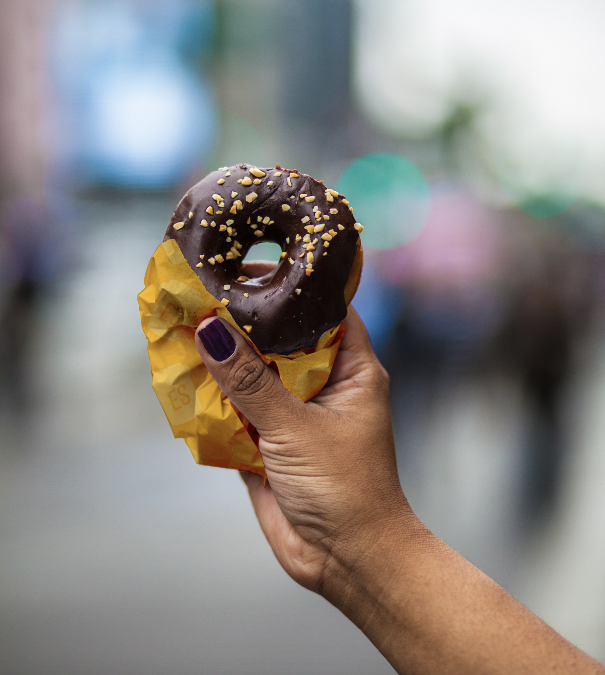
Exasperated Squirrel Food Truck Project
This project's objective was to take two randomly assigned words (exasperated squirrel) then create the branding, brand toolkit, menu, truck design, and packaging.
See Full Strategy & Design Process HERE
Strategy
Commodity items like coffee and baked goods can benefit significantly from the right branding approach. By using expressive typography paired with a simple color scheme, a quirky yet elevated aesthetic can be achieved.
SKETCHES
My initial sketches focused on custom wordmarks with image and typographic lockups. I also explored incorporating coffee and squirrel iconography.
EXPLORATION
Once the general form of the logo was resolved, an extensive study of facial expressions was executed. It was important to nail a look that was both quirky and endearing, as these were core traits of the brand.
REFINEMENT
The wordmark underwent multiple revisions to find the right balance of legibility and personality. With considerations for scaling, uniqueness, and personality, the angled version with the long swooping descender was the winner.


